I have decided the first step of improving the website is to do a list of things that I feel that need to be improved. This ranges from navigation, how the web page performs to what content is on the website and how this could be improved.
As you can see I have compiled a list of things that need to be improved. This list is essential because it allow me to then work through in and order and tick each stage off from the list. I will now go through the list describing in detail with aid of diagrams and plans of how I will do each point on the list.
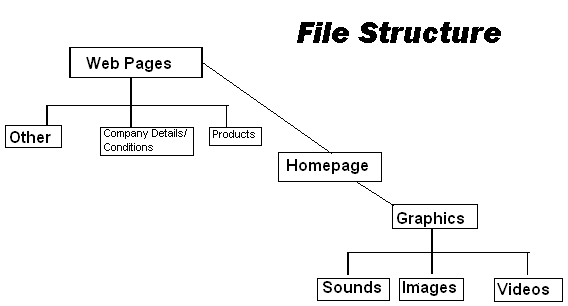
In order to organize the WebPages it is important that firstly the files are organized into a correct way to give ultimate user performance. Once I have organized files and folders I can then precede in improving buttons navigation and enhancing the code. In order to plan the file arrangement I have drawn a plan below to view larger please click on the image. I have also done a plan below of my web page layout. This is essential to do before building and gives me details on how I need to build and arrange my code.

There are many different techniques to improve the website as far as the coding side goes. The current format of code is Java script, this is ok to use and is very popular but I feel that this kind of website could perhaps benefit from actually having CSS styles codes and style sheets. At the moment if there is a simple error in the code for example the web page, it is possible that this will prevent the whole webpage from running. With the use of CSS style sheets this will not only save work and extra coding but it will mean lots of formatting code isnt all on one page and prevents compiling errors.
When improving navigation there were a few things that I could see that could be done. The main problem was caused by the layout. Margins need to be changed on the homepage so all information is showing without the need to scroll down. This can easily be done by simple steps such as using style sheets to create a standard layout and this should fix the problem. There is know need to scroll down, simply because of the amount of blank open space which is not needed.
I do not feel that the graphics on the web page were enough and also varied enough. For instance videos could easily be implemented either by files or even easier by you tube videos. This will give the users a better idea of the products and what they are like. I also feel that sounds could be used on the buttons and in return this would make using the web page more exciting and I think it would make the user more satisfied and present a more professional appearance.
When looking at page facilities I feel that this is not necessarily the obvious aspect that is needed to be improved but simple things like printing of the webpage are going to be used regularly by the user. I found there was however a problem with this and this was that the printing was not well layed out on paper and was clearly not thought of in the designing. This can be fixed by either having a print button linking to a Word file in the correct layout. Or this could be done by the link being done to print the web page but the margins should be adjusted so that they print correctly on paper.
I have carefully analyzed the webpage using a variety of different browsers and discovered that the web layout does change marginally on different browsers. This can be fixed by using a standard code e.g. XHTML which all browsers recognize. This will mean that the layout and content should be presented the same.
The updating of the site was a particular aspect of the web page that I found quite concerning. The date should be clearly presented to the user when it was last updated, this should be done for security and I feel it will make the user think that the webpage is more secure. Also in terms of updating I feel as mentioned before with the use of CSS code instead of java, updating will be easier and quicker for the company to do.